Established in 1989 and formerly known as Cook Ross, Be Equitable is a mid-size consultancy working with organizations to advance Inclusion, Diversity, Equity, and Accessibility (IDEA) in the workplace. Offering consulting, strategy, and training services to clients like NASA, Nintendo, Oracle, and Verizon, Be Equitable helps businesses realize the power of difference and cultivate workplaces where everyone can be. They do this not through one-off training sessions but through becoming a long-term strategic partner to help drive systemic transformations. Recently, with a new owner at the helm — who has been with the company for more than 15 years — Be Equitable introduced its new name and identity, conceived and designed by For The People.* 


To prepare for the launch of this fantastic competition, Rich Tu collaborated with Tré Seals of Vocal Type to design a bespoke wordmark and typeface for launch of the 2021 competition.

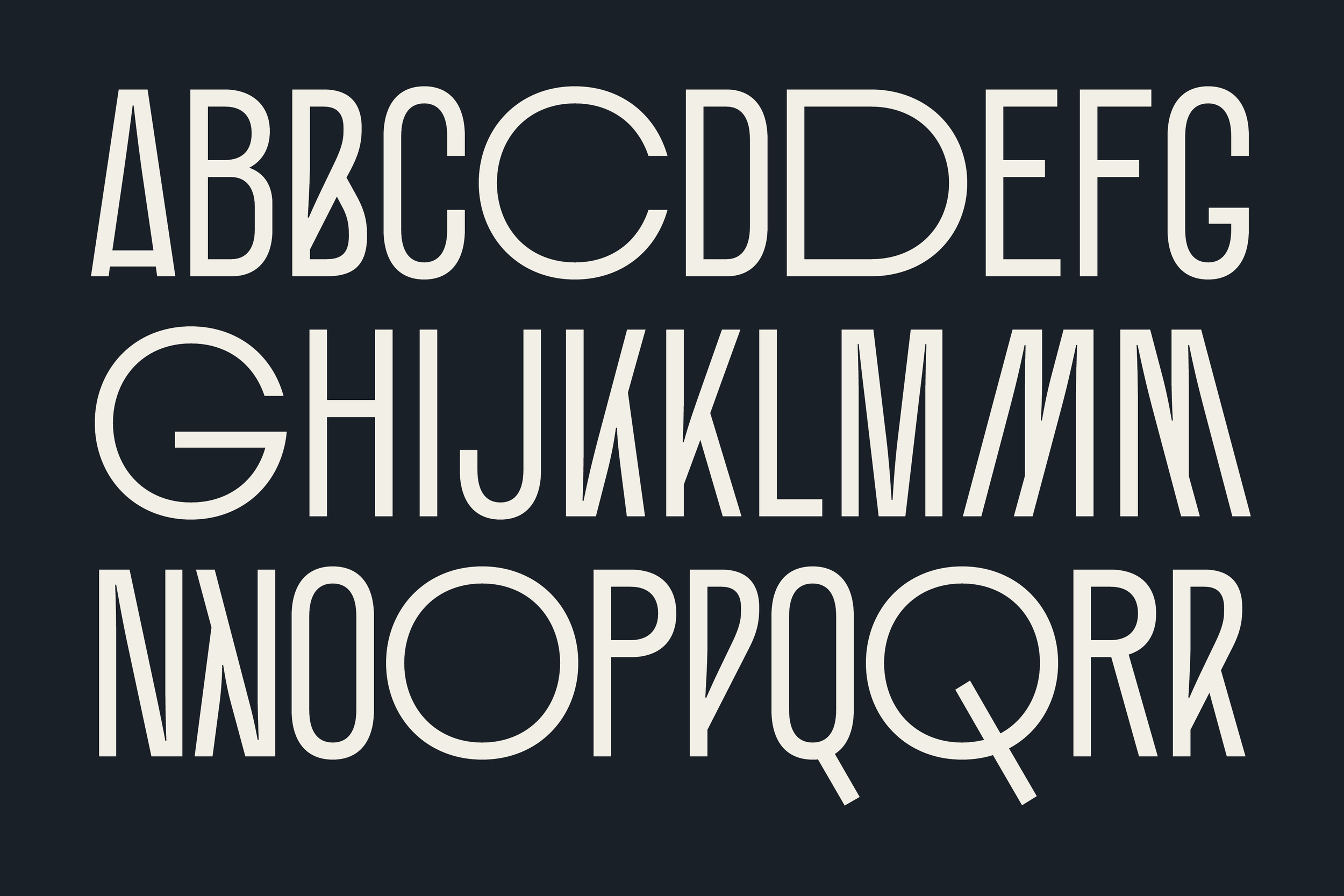
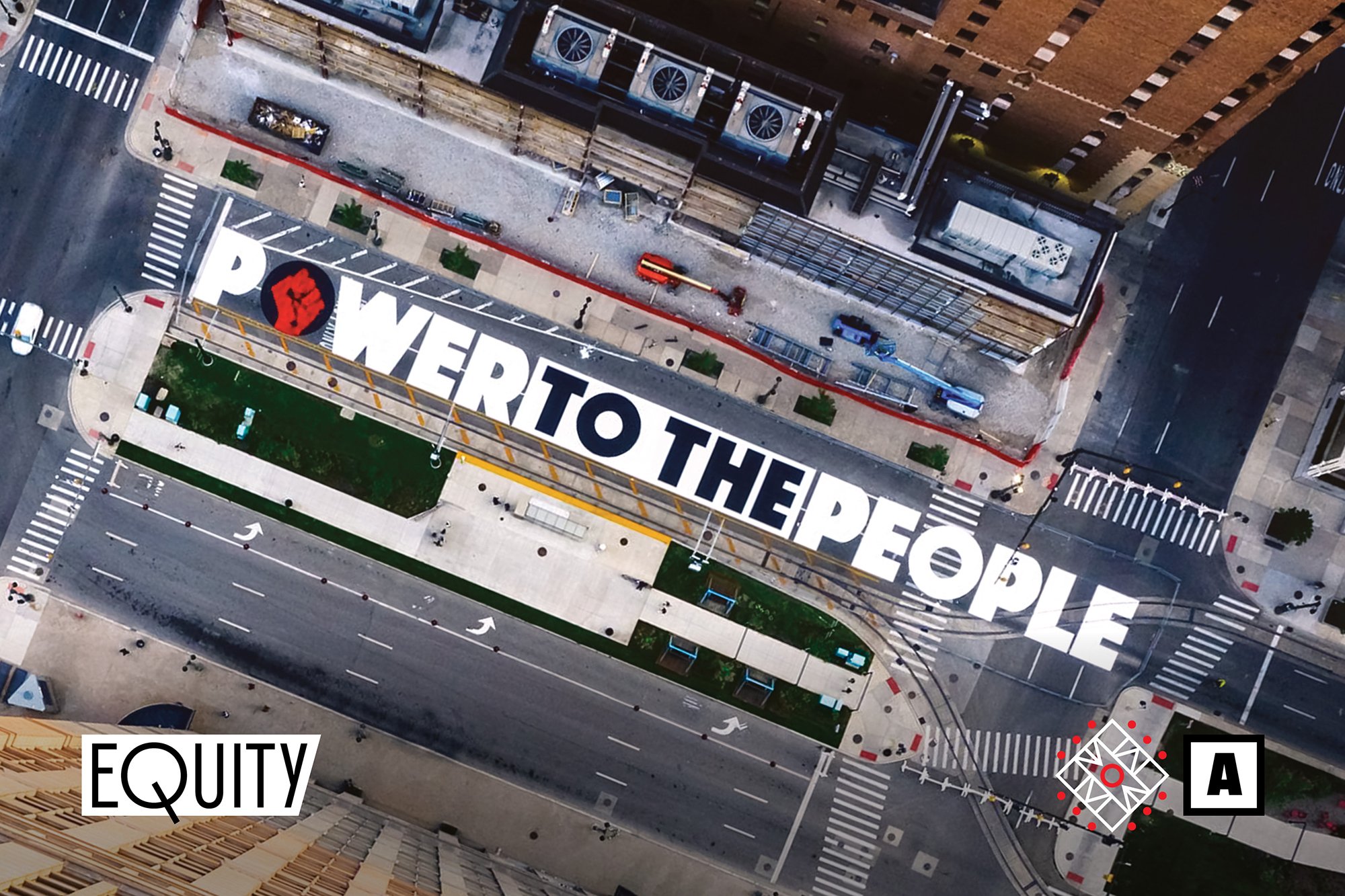
To ensure that the firm had an identity that was unapologetically black and powerful, Vocal created a bespoke typeface inspired by the remnants of the People’s Free Food Program. ¶ When Black Panther Party founders Huey P. Newton and Bobby Seale founded the party in 1966, their goal was to end police brutality in Oakland. But a faction of the Civil Rights Movement led by SNCC member Stokeley Carmichael began calling for the uplift and self-determination of African-Americans, and soon black power was part of their platform. * ¶ With this new concept in mind, the Black Panthers started the People’s Free Food Program. This program provided free food to black and other oppressed people. The intent of the Free Food Program was to supplement the groceries of black and poor people until economic conditions allowed them to purchase good food at reasonable prices. The Free Food Program provided two basic services to the community: 1. An ongoing supply of food to meet their daily needs. 2. Periodic mass distributions of food to reach a larger segment of the community than could be serviced from the ongoing supply. The community was provided with bags of fresh food containing items such as eggs, canned fruits and vegetables, chickens, milk, potatoes, rice, bread, cereal, and so forth. A minimum of a week’s supply of food was included in each bag. * 


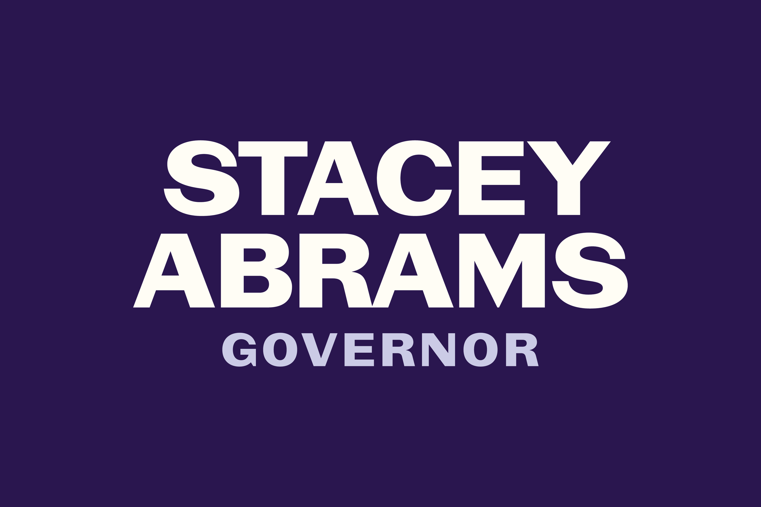
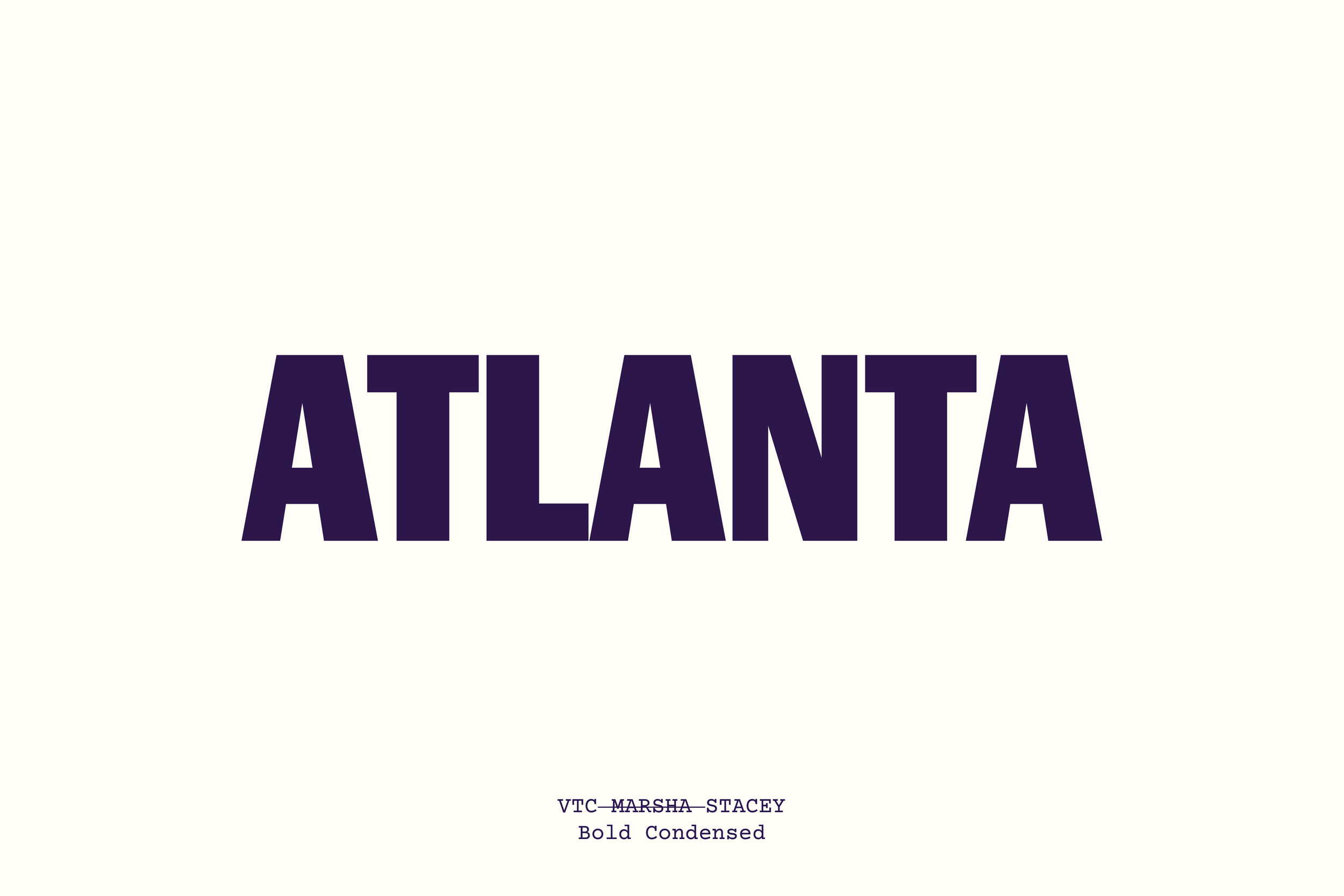
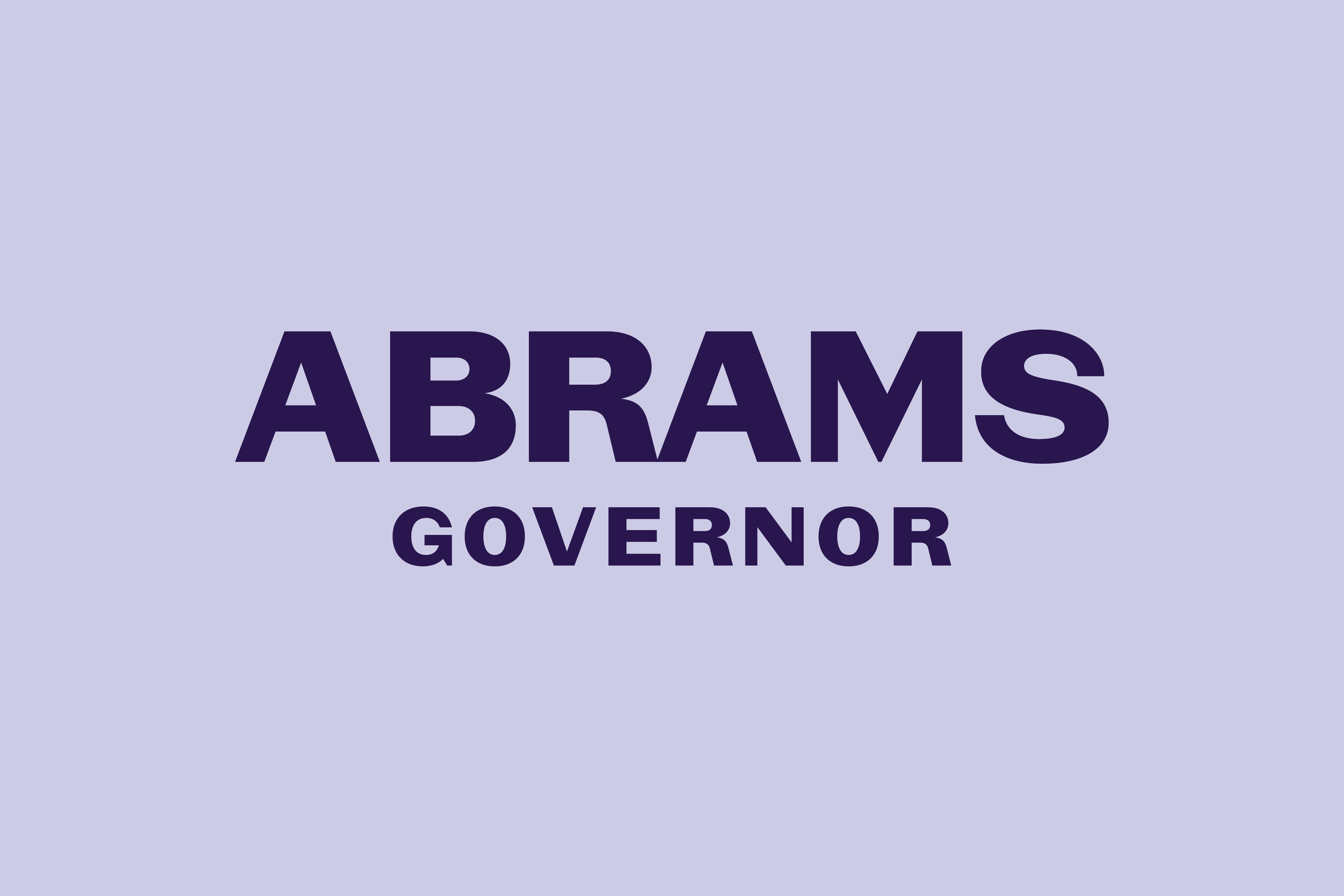
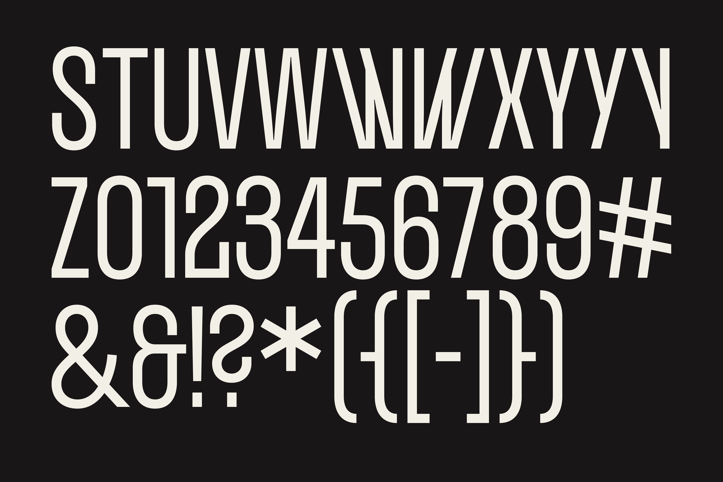
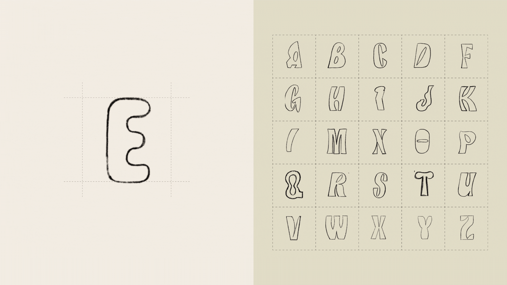
The final typeface, aptly named “Impactful,” is inspired by the grocery bags of the People’s Free Food Program. ¶ While they only needed an all caps headline typeface, I thought it would be important for the typeface to have some versatility, should they need it. Characters such as ‘C,’ ‘G,’ 'S,’ and most numerals allow the graphic designer to switch between flat and angled terminals, allowing for two different tones. 