
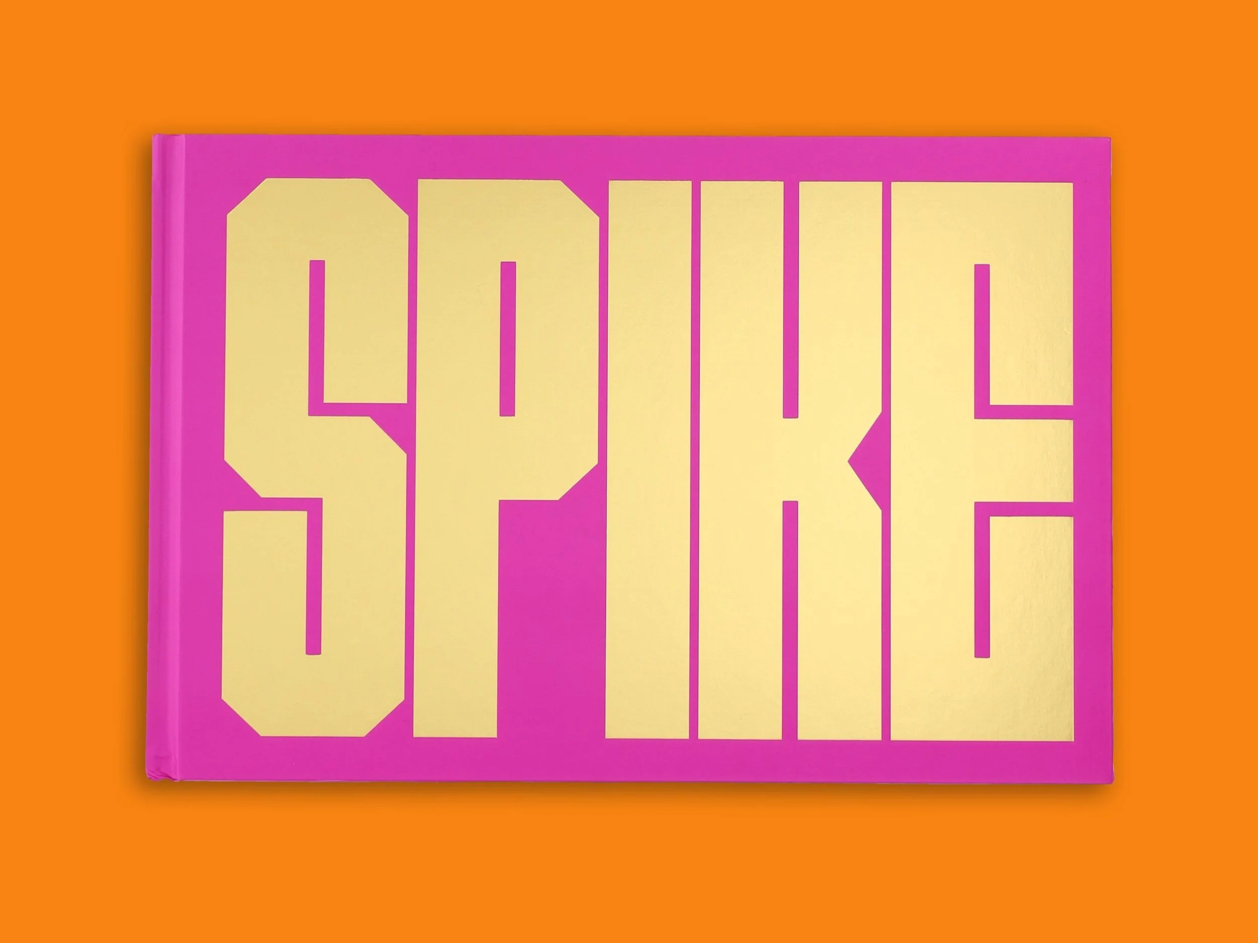
Spike Lee is a world-renowned, Academy Award–winning filmmaker, a cultural icon, and one of the most prominent voices on race and racism for more than three decades. His prolific career has included over 35 films, including his directorial debut She’s Gotta Have It (1986), his seminal masterpiece Do the Right Thing (1989), and more recently, his Oscar-winning film BlacKkKlansman (2018). Spike Lee’s provocative feature films, documentaries, commercials, and music videos, have shone the spotlight on significant stories and have made an indelible mark in both cinematic history and in contemporary society. ¶ For his career-spanning monograph titled SPIKE, a visual celebration of his life and career to date, we designed 5 bespoke typefaces for the book. Once the typefaces were completed and approved by the publisher, Chronicle Chroma, Vocal Type founder, Tré Seals, designed the monograph as well. 


The first typeface designed for this monograph was VTC Spike Headline. A square monospaced typeface with semi-mono alternates, VTC Spike Headline was specifically used for the chapter spreads. ¶ This headline typeface was inspired by multiple aspects of Spike’s life and work: from the “LOVE” and “HATE” rings from Do The Right Thing to the “MARS” chain from She’s Gotta have it; from over a dozen film posters to New York Knicks jersey numbers, and beyond. ¶ The oversized periods were used like blank spacers in letterpress printing, but were designed to emulate Brooklyn city blocks. 


Stemming from the design of VTC Spike Headline is VTC Spike Bold. Originally designed to introduce characters within the captions, this display typeface is a lighter and more condensed version of VTC Spike Headline, and was used exclusively on the spine of the monograph. 


Based on our previously released VTC next 2 typefaces in this family are VTC Spike Text and VTC Spike Italic, both of which were used, primarily, for all of the captions and body copy within the monograph. Oversized versions of these typefaces were also used for chapter quotes and introductions. 


Last, but certainly not least is VTC Spike Tag; a modified version of VTC Spike Italic but Anthony a bit more flare and movement inspired by NYC tags. ¶ This typeface was used exclusively in the introduction and back cover of the monograph for moments when Spike wrote letters to the readers. 